Do you have a proven expertise in web, but want to expand your design services to include print? If you do it right, you can fulfill almost any design request, which could expand your customer-base. This was the case when a design colleague who is a fantastic web developer asked if I had any tips that could help expand his business to include print; especially color matching. I eagerly responded by firing off an email that included about nine years worth of first-hand print knowledge gained by working with great printers (and some not-so-great). This seemed to help him tremendously; hopefully it can help you too.
Color Matching
Color matching is difficult and varies from printer to printer. The only way to consistently hit a color is by using Pantone colors on an offset press; however, this is costly and only recommended for large quantity jobs. With low-quantity digital printing, you’re at the mercy of the printer and how often it’s maintenance and calibrated. Having a print shop you trust is also very important. I’ve had print shops drop the ball completely, but I’ve also had trustworthy printers go above and beyond. Trial and error is key; once you deal with enough print vendors, you’ll be able to differentiate the shady one’s from the ones that care about quality and customer service.
You Get What You Pay For
If you’re looking for the cheapest digital printer because that’s all you can afford, you’ll most likely not love the end result—no matter how good your design. There’s not a lot of profit margin on low-quantity digital prints, so little care is put into color calibrated / matching or quality. I’ve felt that my small jobs were neglected because the printer just wanted to get them out of the way in order to make time and room for the bigger jobs. Not fair, but I get it…and if this happens, don’t be afraid to call them out on it. I like to build relationships with printers who do quality work and go above and beyond, and drop a few hints that I’m a designer that expects work of a certain quality. Sometimes just letting them know that you’re not gonna take any shit will go a long way, and they’ll pull out the extra stops to ensure that the finished result is of the highest quality. I use the same printer for everything because they do stellar work cost-efficiently, they respect me, and in return I trust their judgment. Go above and beyond the call of duty, and I’ll keep feeding you files to print.
The paper stock you use will affect the color as well. Glossy, coated stock makes the color more vibrant (since it sits on the surface), while matte, uncoated or textured stock absorbs the ink which decreases color vibrancy.
The Press-Check is Your God-Given Right!
Your printer should always allow you to do what’s known as a press-check; meaning, you can be there when they print the job so you can sign off and approve the first test sheet to ensure that the color and quality is to your satisfaction.
Printers love printing botched print jobs, because they make twice as much money when you have to reprint it. But to protect yourself you are entitled as a customer to see a hard-copy proof before he hits print. Even if it’s just one super-large banner, he can run off a small section of it in-advance (and free of charge) for you to see how his printer will produce the color. It is at that time that you compare it to your swatch book, and if it is off he can calibrate the printer to hit that color. He should be having you sign off on proofs before printing anyway. If he’s not offering them, ask for a hard-copy proof. It’s standard practice and just lazy (or deceitful) on his part.
Also, any good printer has the capability to adjust the 4-color process digital printer to hit a PMS color. I print a lot of low-quantity business cards that I designed with a PMS color in mind, but it’s not economical to run 500 business cards on an offset press; so they print our cards digitally, and created a custom print profile setting where the tweaked and calibrated the color to consistently hit a PMS equivalent every single time. Don’t let your printer tell you this is not possible; It is.
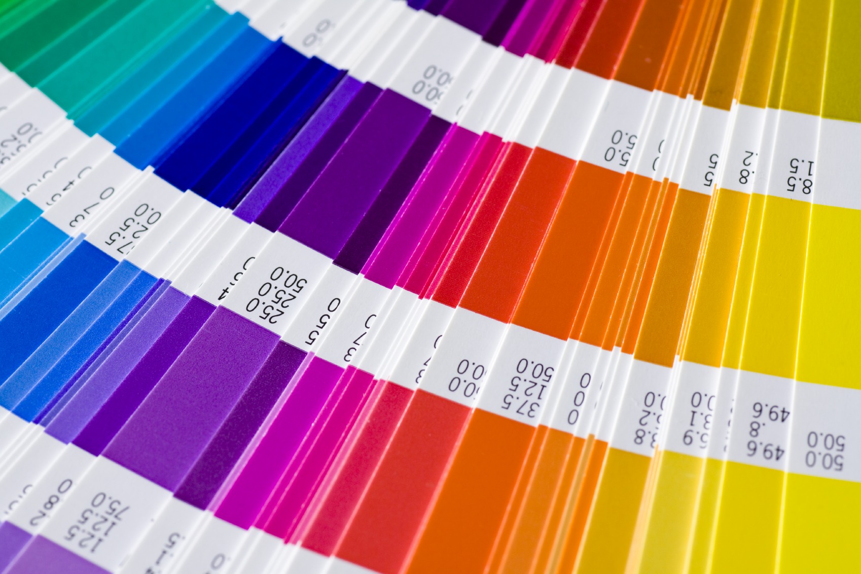
And do yourself a favor, get yourself a Pantone Formula Guide . That could be the cause of many headaches for you as you’re arbitrarily sampling colors with the eyedropper in an RGB color space, and wondering why the color is off. As you’re well aware, the monitor is RGB and print is CMYK. Computer monitors do a mediocre job at representing CMYK colors on screen, but it will never be accurate (if your monitor hasn’t been color calibrated recently, you can throw all hopes of getting even close to a color-matched print). Your best bet is to get a Pantone swatch book that shows you pantone colors, compared to their CMYK equivalents.
His Response was classic: Did I just get schooled? I think I just got schooled?!?!
There you have it; 13 years of print experience dumped out in one email with my old friend and design colleague. This seemed to help him tremendously, hopefully you get something out of it tool. Feel free to email me or leave a comment if you have any questions or would like to argue instead. Till next time…