Creating My Own Graphic Designer Identity (And Why It Took So Frickin’ Long)

After the launch of my first serious website in 2012, I realized that being a designer without an identity was no longer an option. At the very beginning of the project, I asked myself a few key questions that determined that I needed a logo that was extremely versatile. It needed to be so versatile in fact that it could represent a graphic designer as well as an illustrator, and it needed to communicate to a diverse market, from serious art directors to family-oriented clients. Coming up with creative solutions left me completely stumped, as I explored a multitude of cringe-worthy concepts, and my dual role as designer and client wasn’t helping. Then during a long drive home from the shore, my relaxed subconscious designed the logo for me, proving that sometimes you just need to walk away, clear your mind, and approach the problem from a fresh perspective.
The Starbellied Snee
In January of 2011, I explored the idea that I could brand myself in the style of Dr. Seuss. His book called The Starbellied Sneeteches gave me a plethora of ideas and design elements to play with. It was a stretch, but I knew if I executed it perfectly it could be a huge design success. The playful nature of the hand-drawn typography and vibrant palette would also work well for my illustration business.
After only scratching the surface, I started to think that branding myself in someone elses intellectual property and style could lead to lots of trouble down the road. Plus, if I’m going to brand myself, I want it to be a fresh and new idea. Sadly, I scratched the Starbellied Snee idea.
Next, I started exploring the use of metaphors and icons in my logo, which were horrific. I had this idea that I could somehow combine a marker and an arrow, tech with tradition, a paintbrush and a mouse, you get the point. But that just felt hokey, forced and uninspired.
Helvetica – The Yoga Pants Of Typefaces
After beating my head against a wall and getting nowhere, I decided to walk away for a while, hoping that the solution would come to me in a dream or appear out of thin air. In the meantime, I created a temporary place saver logo out of a simple “Sn” set in Helvetica. It doesn’t get more minimalist (a.k.a. bland) than that. In hindsight, I don’t know why I chose the letters “Sn” instead of my initials “CS”, or just using my full last name “Snee”. Anyway, I had every intention of this being a temporary solution and put little thought into it. Then I became very busy and paying clients took priority over my self-imposed, self-branding designer identity project. No solution magically appeared in my dreams, and my “temporary” place saver became my social media favicon, then my letterhead, then proposals and invoices. I knew it was horrible…but I needed something and had nothing better.
I’ve read Paul Rand’s strategy for successfully solving design-related problems is to think about it incessantly, then walk away and let it incubate in your head. This allows your subconscious to pull resources you didn’t even know you had, and in many instances solve it for you. This strategy works, and my logo is the proof. Here is an excerpt for Paul Rand: Conversations With Students by Michael Kroeger:
The second part of the process is incubation. You forget about it, and let it incubate. Let it simmer in your mind. This is not anything I invented. This is some very bright guy discovering how these things work. I know that it works in my case, that if I do something and I am having problems with it, I forget and come back to it the next week or the next day and something happens. The incubation period is very important, to forget for a week, or a day, or whatever. You take the time so you can decide.
Prior to leaving for a four-day Ocean City, Maryland vacation, I started thinking about my designer identity problem again. I tried to force a few unsuccessful ideas, and was now playing around with anagrams. I put this challenge away once again, packed my suitcase and went to the beach for a long weekend of relaxation and sun.
The “A-Ha” Moment
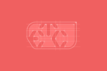
On my way home, we hit a nasty storm. It was one of those storms where one minute it’s beautiful out, the next there’s no setting fast enough on your wipers to enable seeing out the window. This was the A-HA moment. I GOT IT! Perhaps it was my relaxed and reinvigorated state-of-mind, or maybe Mr. Rand was right and during vacation my subconscious continued working to solve this design problem. It doesn’t matter how I got there; all that does matter is that while sitting in the car in the midst of a sudden storm, I began picturing my initials forming a storm, swirling together with a vortex in the middle that would destroy everything in its path.
As soon as I walked in the door from vacation, I started sketching my new graphic designer logo. Crudely at first, but after drawing and redrawing it a few times, I was getting close. During the design I paid particular attention to considering all David Aireys logo design principals from his fantastic book Logo Design Love. Read the post about these principles from Logo Design Love.
Now I have a graphic designer logo that’s not specific to any industry–it’s specific to me. I can use this to brand myself as a designer, as an artist, as a musician or even as a shoe salesman and it would still be appropriate. It took a long time, but good things come to those who wait.
1 Comments
Comments are closed.
I agree with all the above in you design process and my own similar design process has led me to create the perfect logo for my design business which truly represents my personality and all my clients know exactly what the company stands for.