The Process and the Politics: Logo Redesign and Rebrand in a Corporate Environment
Redesigning the ETC logo was one the most strenuous, yet rewarding jobs I’ve had (so far in my career). I jumped into this project fully-prepared for a challenge, but remained confident that my experience and education would enable me to be successful. What I was not prepared for was the political minefield that is corporate culture, and the internal resistance of change that can accompany a corporate rebranding campaign 43 years in the making.
Why I’m Sharing What I Have Learned
As a graphic designer during a corporate rebrand, there are many responsibilities—most of which are not even remotely related to design. You have to be well organized and an efficient project manager. You need certain skill sets that you may not have going in, but will develop to survive. The ETC corporate rebrand was comprised of an often overwhelming amount of little tasks that needed to be resolved before moving on to the big picture. Little tasks like taking inventory and budgeting the replacement of soon-to-be-outdated literature. Getting all the necessary approvals and signatures. Putting together presentations, style guides and emails outlining the changes. Making people in the company aware that this was going to happen, and calmly diffusing voices of dissent. All this while still doing the day-to-day design tasks that land on your desk. It is only through living this experience can I appreciate the enormous accomplishment that was rebranding ETC.
A graphic designer in a corporate rebranding campaign plays many different roles:
- Salesman: Being able to sell your idea and get decision-maker buy-in. Convincing superiors that their logo is in trustworthy hands.
- Human Resources: How to involve employees and create unity in the workplace; rather than impose change.
- Marketing Strategist: Conducting Focus Groups and doing market research.
- Zen Master: How to stay calm, positive, proactive and handle the criticism and comments you will undoubtedly hear from every co-worker with an opinion.
The Number One Challenge
Designing a logo for a start-up company is not simple, but far less involved than redesigning a recognizable mark. My biggest challenge was the 43 years of equity invested in the existing ETC logo. Many employees saw this mark as their sales companion, and presumed any deviation from what they were comfortable with will negatively affect business. This road block manifested every step of the way, causing me to frequently question the integrity and necessity of this entire endeavor.
Learning From Other Rebranding Fails
I began researching some Corporate Rebrands and Logo Redesigns that had negative effects. This was beneficial to the process and gave me a greater understanding of what NOT to do. However, this is not recommended for those easily spooked. Tropicana Sales dropped by 20 percent when the new design rolled out, returning to the old packaging only 2 months later. After only a few days of online logo bashing, The GAP reverted back to the classic logo. It wasn’t long until the GAP executive who oversaw the rebrand “departed” the company.
Setting Goals
Before beginning, you need to set goals. Meet with decision-makers and pick their brain. Ask them what they want to accomplish from the rebrand. Sometimes the decison-makers don’t even know, but having this open dialogue will help them figure it out. No matter how good the new logo is, you will inevitably fail if the needs of the Corporation are not met. The following goals were set before thinking of design:
The corporate logo rebrand is enacted to better reflect the high-quality and high-tech company that is ETC. It is intended to improve the reception and perceived value of our brand by our customers, existing and potential; our partners, from vendors to supporters and shareholders; and current employees and potential new hires. ETC also wishes to emphasize the relationship between individual business units and the bona fides provided by ETC’s 43 years of history and reputation.
Establish a Strategy
In March 2011, The CEO requested the plan from creative. Some of the major items addressed included:
- Investigate ways to refresh the corporate logo without losing the well established identity.
- Modernize and enhance the corporate literature (business cards, letterheads, envelopes, forms, email signatures).
- Implement the new literature and Corporate Rebrand over the course of 1 year.
- Have a consistent corporate stamp on all materials. Move away from segregated business units and toward a more unified corporate culture.
Preliminary Research
We researched other companies and discussed how they updated their logos successfully. After the research phase, we began discussing a VERY BROAD range of logo explorations. These early discussions helped to conclude:
- Reinventing the ETC logo is no longer an option. We want to still be identifiable to our existing customers, as we have already invested 40 years of equity in the logo. We also want to consider the original designer, Mel Richman, whom helped launch the company in 1969 by continuing to use his graphic in a repackaged and evolved format.
- The full company name “Environmental Tectonics Corporation” is more problematic than beneficial. When explaining the name it confuses customers and often leads them to misinterpret what ETC does (no…we’re not an earthquake company or environmentalist corporation…)
- Additionally, the name is not ideal for branding purposes. It is long and horsey when spelled out on sales materials. We will no longer be using the full name in conjunction with the mark—this is called a Trade Name. Click to read my post regarding the use of corporate trade names.
Narrowing Our Options
The committee narrowed 20 logos down to 3 diverse directions we felt had promise.
- Negative Space: Use the classic ETC logo in the negative space of a rounded shape. Rounded shape should help modernize the bulky logo and off centered treatment will help convey “forward-thinking”.
- Arrow: Arrow pointing up symbolizes aviation, altitude, environment, oxygen, increased temperatures, atmosphere, space—all markets that ETC serves.
- ETC deals with the Space and Aviation Industry. We felt an Abstraction of Earths curvature would add some nice curves to the treatment and communicate this relationship
Seeing the Logo Concepts in Context
Over the next week, many instances of each logo were created to visualize how the logo would affect the overall image of the company and how it would look in different formats. This is the only time that the use of Photoshop in logo design is appropriate. It was only after seeing the big picture that a decision could be made as to the most appropriate direction. The refresh committee and the Creative Department unanimously agreed that option 1—if developed further—could be a good candidate for the ETC refreshed look.
Pitching The New Logo To The CEO
I’ll be honest—I lost a little bit of sleep the night before we pitched our concept to the CEO. I was nervous that it would be dismissed instantly, and the 4 months of preparation and planning would be in vain. However, it was very well received. In fact, he was surprised that we didn’t change it more! It was at this time that I got the approval to pull the trigger on the Global Corporate Rebrand of ETC.
Time to Refine the Logo
Over the next week, hundreds of logo variations were created and we began thinking about color. Towards the end of this experimentation we found that enclosing the shape within the confines of a border enhanced the readability of the logo. The line helped cap the top of the “T” which can be misinterpreted as an Arrow and helped better define the edge of the “E”.
The next step is presenting this logo in front of ETC employee’s for feedback from an outsider’s perspective.
Conducting Logo Redesign Focus Groups
Until now, the new design has been seen by a very select group of people, in an effort to avoid “too many hands in the pot”. The time has come to consider how the rest of the company—the salesmen, engineers, the maintenance guys—would view this mark. This valuable insight into how “non-creatives” perceive the logo will either destroy or validate this initiative.
Good Logo Design Checklist
Since this post focuses primarily on The Politics and Processes of a Corporate Re-branding Campaign, I decided to create a separate post focusing on the actual art of logo design. Click for Tips on Successful Logo Design, and how these tips were applied to the updated ETC logo.
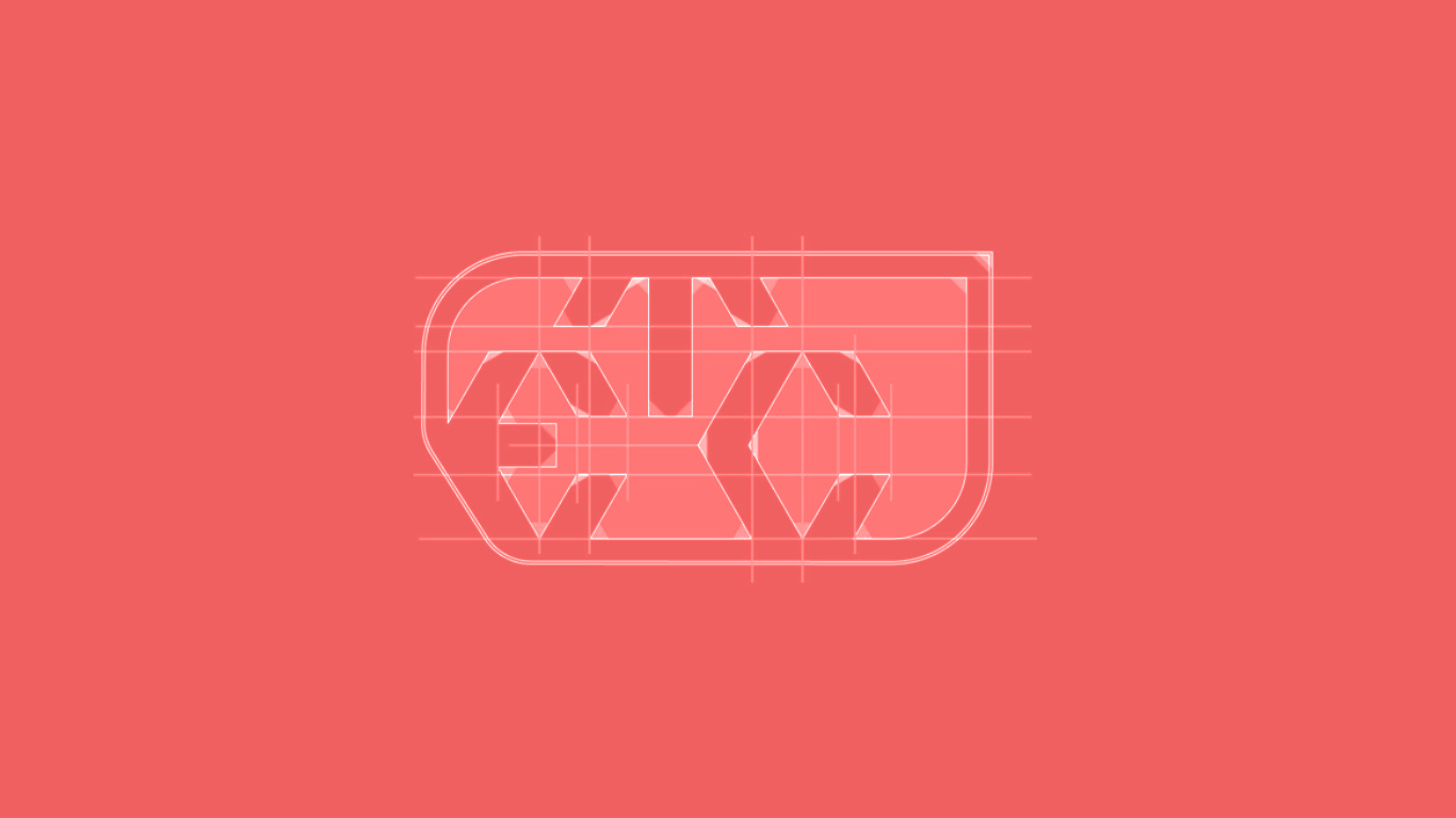
A Precision Engineering Company Requires A Precisely Engineered Logo.
The original ETC logo was drafted by hand by Mel Richman in 1969—leaving us no digital file. Over the years, this logo was recreated as needed, by numerous people, with varying degrees of accuracy. Since the integrity of the original logo has been repeatedly compromised over the past 40 years, the corporate refresh gave us the opportunity to perfect the form once again.
The final step of the design process was handing the Illustrator file over to Industrial Designer Bradford Waugh to mechanically ensure absolute perfection of line measurement, angle and consistency using Autodesk Inventor. ABOVE: Original ETC logo brought into CAD and examined. The circles denote inconsistent angles, tangency, or lack of parallel constraint. The yellow lines indicate points or angles that fail to fall on the same horizontal or perpendicular vector. Dimensions were pulled but there’s no consistency to them. ABOVE: New logo, redrawn in CAD to perfection. Dimensions were given to each segment to ensure security of geometry as well as to establish a standard in case logo becomes compromised.