Logo design is about more than artwork; it’s about decision-making and client management. It’s a long process of exploration, requiring a multitude of ideas be developed in order to trash all but one, final mark; one that perfectly represents a business and speaks the language of its customers. Clients turn to designers to convert ideas into flawlessly executed art, but most pay little mind to the creative journey us designers take before even turning on the computer. Using my logo for Preservation Health as example, I’d like to share with you the complete logo design process; one that starts with the sketchbook and ends with a happy client.
Prior to the commencement of the Affordable Care Act (aka ObamaCare), I was approached by an up-and-coming medical practice to design their logo. They called themselves Preservation Health, and their specialty is concierge medicine (also known as direct primary care). This new approach to treatment requires no insurance, and offers patients 24/7 access to their doctors, so it’s easy to see why it appeals to so many. An attractive business model deserves an equally attractive logo, so I teamed up with Preservation Health to create an identity program communicating that PH patients can expect a strong, healthy, and enduring life.
Mind Mapping
I began this project by utilizing an exercise I learned from David Airey’s book “Logo Design Love”, called a mind map. This word-association exercise helps designers consider as many different design directions as possible, at a stage when they’re most needed. Essentially, just writing the word that’s central to the design brief, then branching out from it with as many words that pop into your head with the goal of forming a large thought cloud that you can refer to when sketching ideas. At the end of the exercise, I highlight the words I feel have recognizable visuals or spark an idea.
The mind-mapping stage accelerated my though-process, and the highlighted words gave me good fodder to start sketching. I think it’s incredibly important to quickly sketch as many ideas as possible in order to capture the raw thought before it fades into obscurity. I don’t limit myself to just good ideas either. The main goal at this point is to explore ALL ideas; the good, the bad, the ugly, and the down-right embarrassing.
30-50 Ideas Minimum
I read somewhere that it’s only after you sketch 30-50 ideas that you get past the cliché and obvious, forging new creative ground. I hit about 30 before narrowing them down to 5 solid concepts worthy of presenting to my client, the strongest being the Greek column.
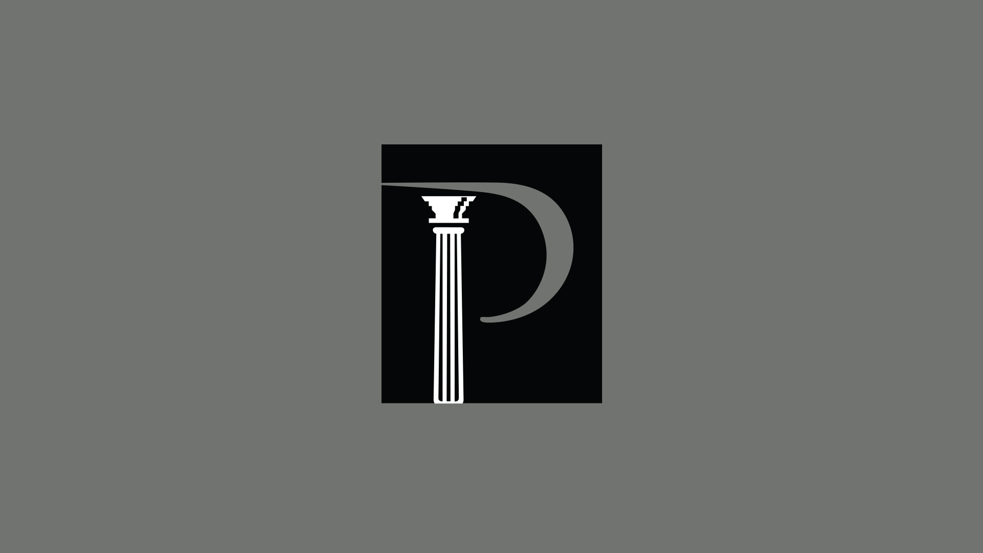
During my pitch, the client liked the idea of conveying strength and stability through an ancient Greek column. This visual also identifies with the word preservation, as these ancient columns still stand today almost 2,500 years later.
Enter The Computer
This concept uses a Greek column as a visual metaphor for strength and stability, and reads as the letterform “P”, set in the Trajan typeface.
With the concept approved, I scanned the sketch and began working in Illustrator. Careful consideration is spent creating a logo that is simple enough to be legible at the smallest sizes and versatile enough to be used on both light and dark backgrounds. A certain level of self-control is needed to find the perfect balance of simplicity and detail; too much detail creates visual clutter, which affects the readability of the mark.
Combining the Greek column and the letter “P”, set in the Trajan typeface is a success so far. But I’m confident I can simplify the form even more, which will benefit the design by increasing legibility, enable better quality reproduction at small sizes and will commit to the memory of the viewer easier.
I cut the stem off the form added a few more thick lines within the column. The final step was enclosing the Preservation “P” within a black box so I could keep the column white, helping reinforce the relationship with an ancient column, which was often constructed from white marble.
“Chris was great at providing imagery, guidance and education behind branding a logo that represented our objectives. After many revisions and lots of discussion, an image that was clean cut, precise and capturing came to fruition. Immediately Keith and I knew that Chris hit the nail on the head. The final logo was born! I can’t say enough nice things about Chris. He is a talented artist, an insightful communicator (both in utilizing language and pictures) and just a generally nice, honest guy.”
– Vivi Sadel / Preservation Health, LLC